From Brief to Brand:
Rethinking the Calculator — One of Design's Most Overlooked Canvases
Case study no. 04 — the fourth in an ongoing series where I take a fictional brief and build it like it's real.
Calculators are invisible. Not literally — you use one probably every day — but invisibly, in the sense that nobody thinks about them. They're utilities. They ship with your phone, they do their job, and nobody writes a case study about them.
That's exactly why this brief interested me.
DailyUI prompt 004 was: design a calculation element or interface. Scientific? Mortgage? Currency? Speciality? And for what platform? The open-endedness was the challenge. I could have gone niche and clever — a tip-splitting calculator for restaurant groups, a runway calculator for startups. Instead, I went in the opposite direction. What would it look like to design a multi-tool calculator that felt genuinely refined? Clean enough to be beautiful, functional enough to be used daily.
What I built
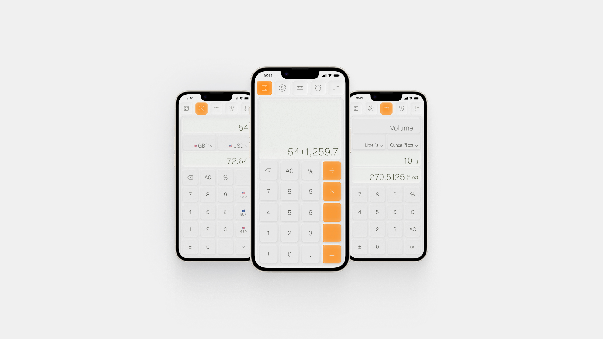
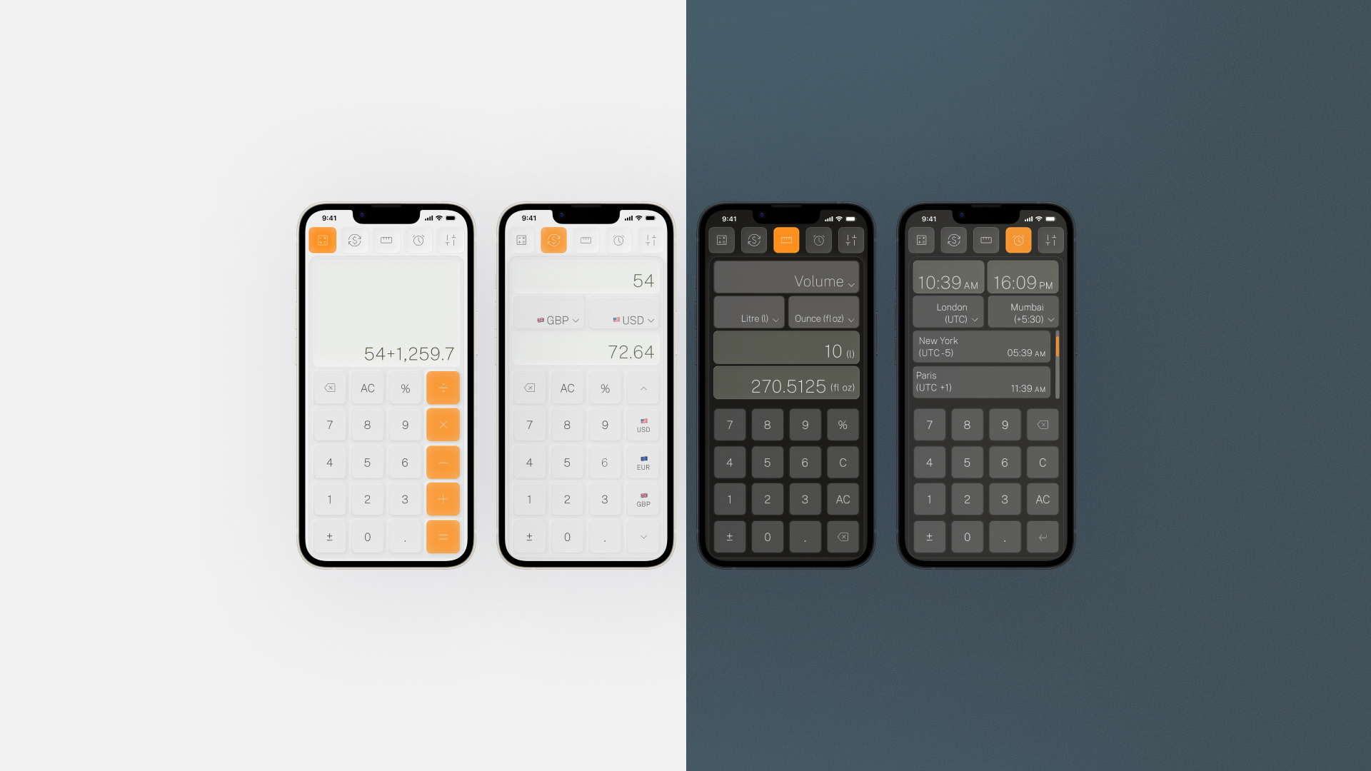
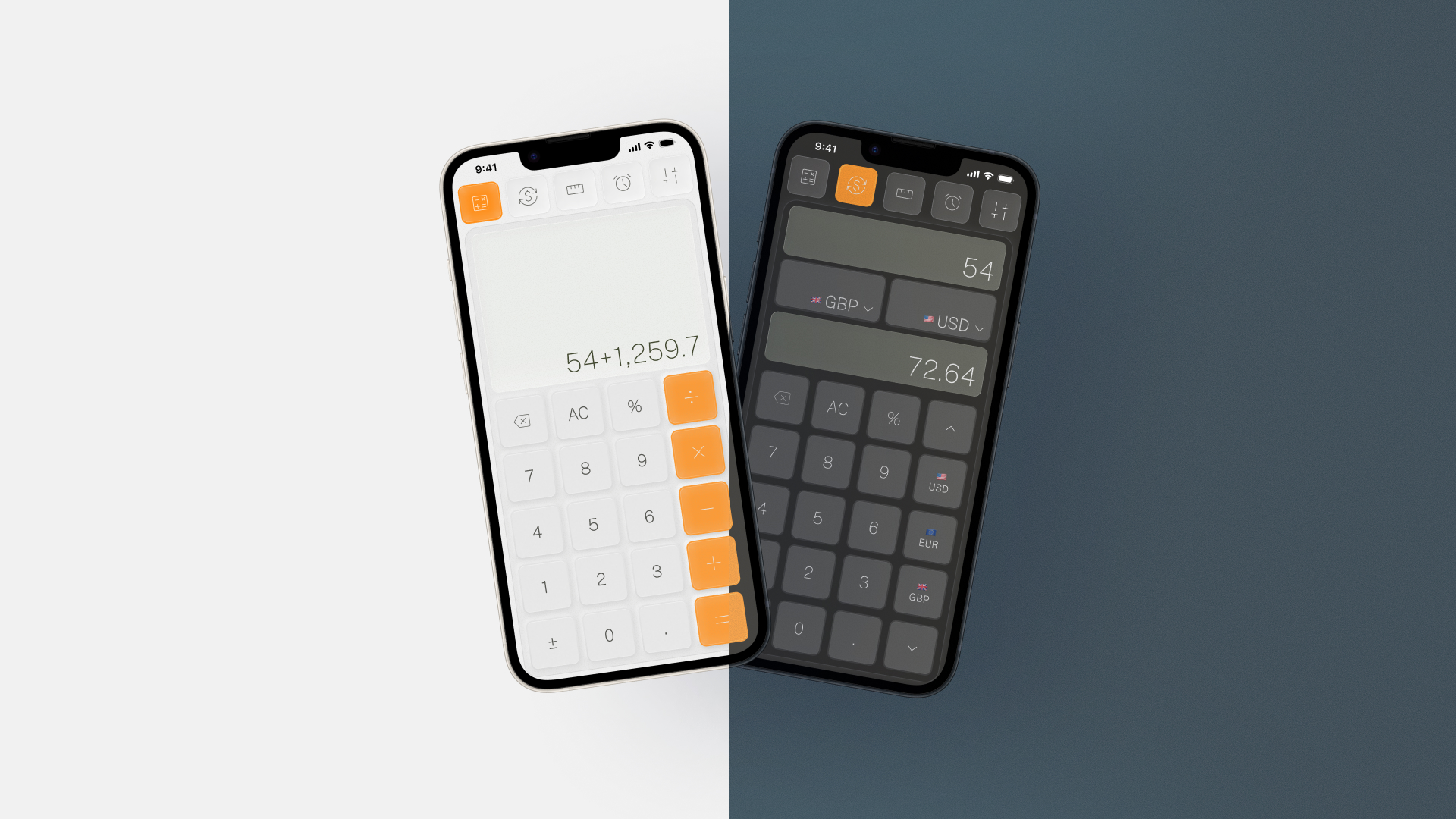
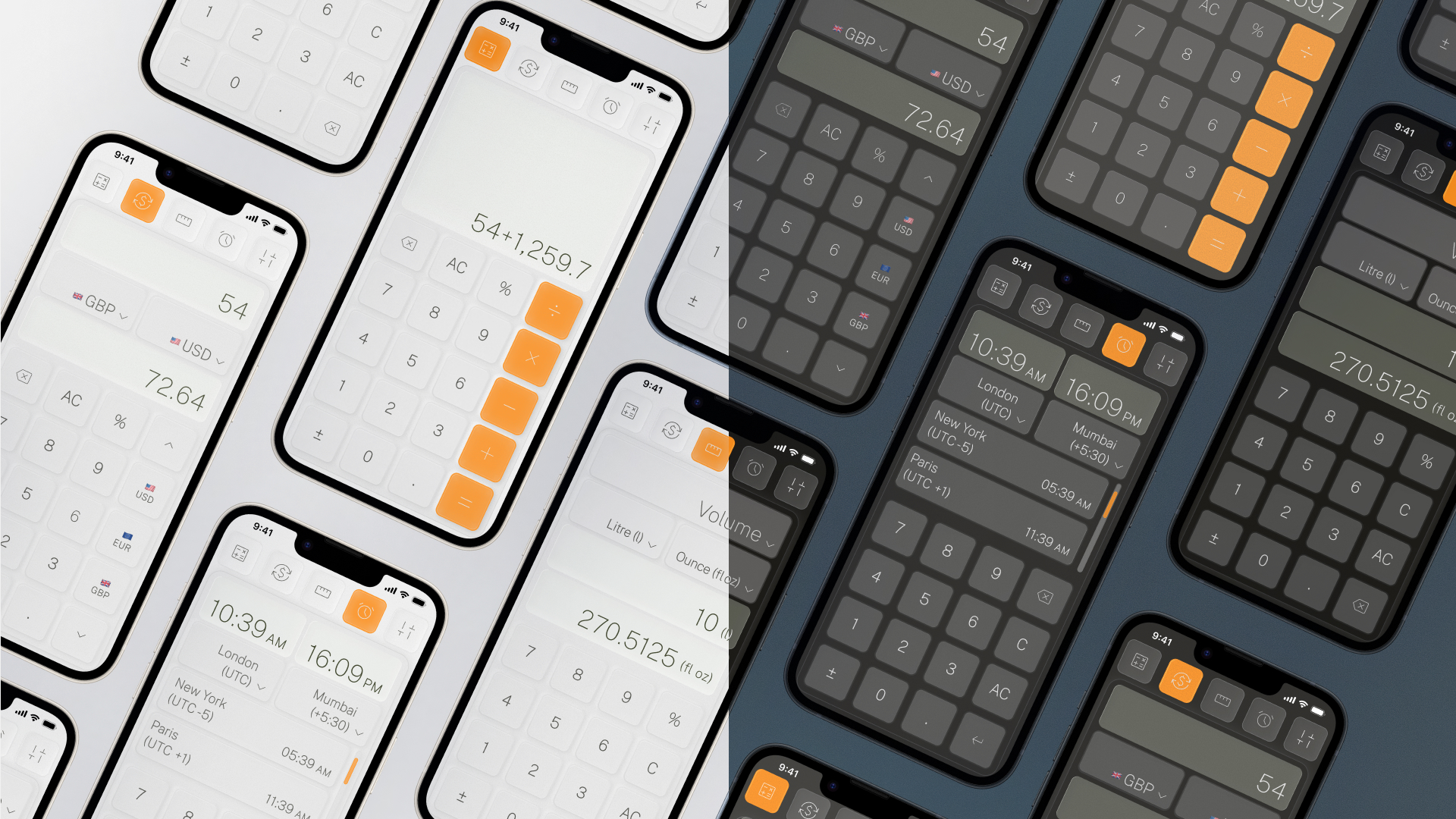
The result is a multi-mode iOS calculator UI with four distinct modes accessible from a persistent top navigation: a standard calculator, a live currency converter, a unit converter (volume in the prototype), and a world clock/time zone tool. Light and dark modes are both fully realised, with the dark variant using a cool slate-blue tone rather than the predictable near-black — a considered choice that gives the dark mode its own character rather than just inverting the light one.
The design decisions worth unpacking
Three things drove the outcome here more than anything else:
Restraint over decoration. The temptation with utility UI is to compensate for simplicity with visual complexity. I went the other way. Soft shadows, generous border radii, and a near-white background in light mode create depth without noise. The interface recedes so the numbers don't have to compete.
Device testing as a non-negotiable
Before finalising anything, the designs went to the device. This is always part of the process — testing on an actual screen at actual scale — and with a calculator, it's especially important. Touch targets for number keys need to feel natural under a thumb, not just look balanced in a Figma frame at 390px. The spacing between the operator column and the number grid, the visual weight of numerals at different sizes, the contrast of secondary labels like currency flags — none of this reads the same on a monitor as it does in your hand.
What's next
This series keeps going. Each brief is a new constraint, a new corner of UI design to explore — and a new reason to think carefully about something that usually just ships.
Tags: mobile UI design, iOS app design, calculator UI, utility app design, dark mode design, UI/UX design, DailyUI challenge, app interface design, interaction design, mobile app UX, product design portfolio, daily UI 004, multi-mode app design, colour system design