
From Brief to Brand:
The Icon Is the First Impression
Case study no. 05 — the fifth in an ongoing series where I take a fictional brief and build it like it's real.
An app icon isn't decoration. It's the first thing a user sees — before they've tapped, before they've read a description, before they've decided if the app is worth their time. It lives on a home screen alongside everything else competing for attention, and it either holds its own or disappears.
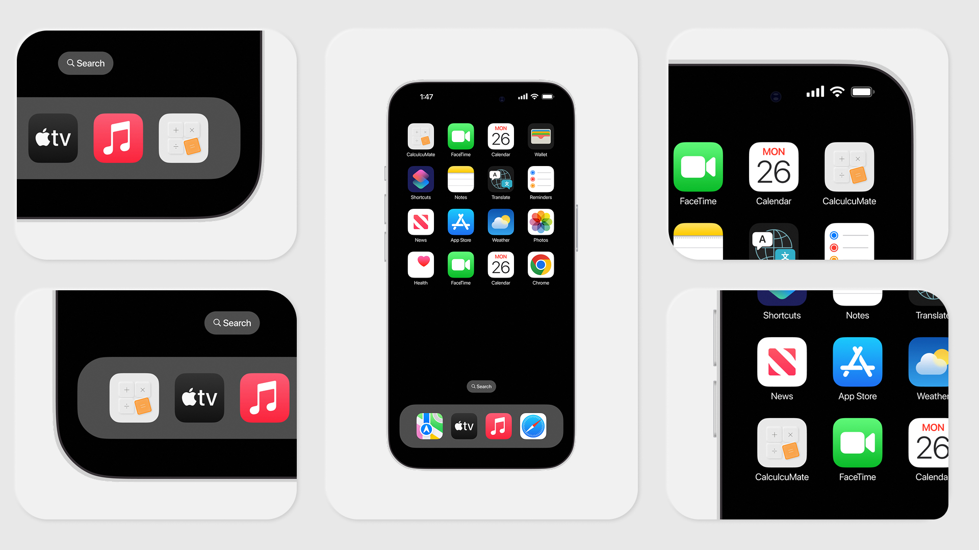
DailyUI prompt 005 was the app icon. Since Case Study No. 04 introduced CalcuMate, it made sense to treat this as a continuation — not a standalone exercise. The icon had one job: to represent the app honestly while working at every size, in every context.
What I designed
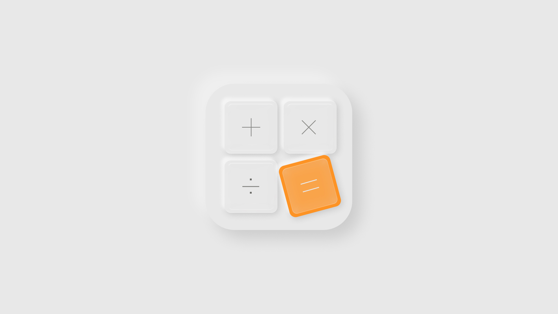
The design moves through two stages. The concept is a minimal, outlined composition on a warm gradient — four operator tiles in a 2×2 grid, with the equals key rotated slightly off-axis. Breaking the symmetry introduces movement; the interface feels mid-use rather than idle.
A Few Decisions Worth Noting
The icon wasn't designed in isolation — it was designed as a distillation of an existing product identity. Corner radii, surface language, accent colour: everything traces back to Case Study No. 04. The neumorphic treatment earns its place here because calculators are tactile objects; the pressed-key quality makes contextual sense. And the single orange tile does what a focal point should — the eye finds it at 1024px and again at 60px.
What's next
This is Case Study No. 05 in the From Brief to Brand series — each DailyUI prompt treated as a real design brief, documented from first principles to final output.
Follow along for Case Study No. 06
Tags: app icon design, iOS icon design, neumorphic design, mobile app design, icon design process, UI design, UX design, DailyUI challenge, daily UI 005, product design portfolio, app branding, icon system design, mobile UI design, iOS app icon, Apple icon guidelines