Built to Last, Part 1:
How do you build an email strategy for a jeweller that's been trading since 1974?
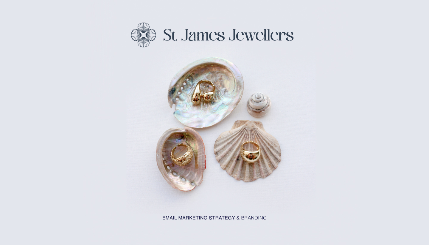
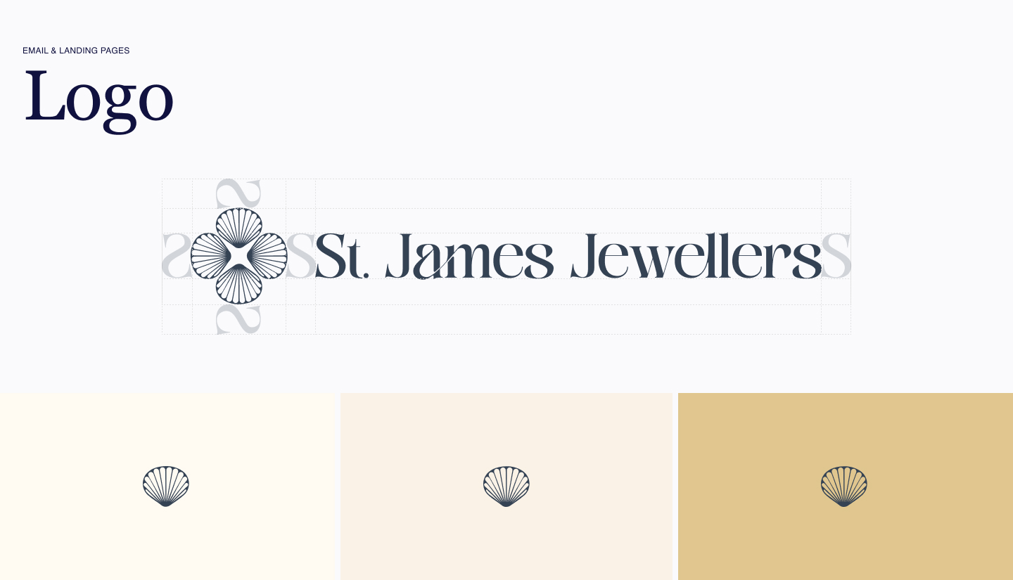
Inside the St. James Jewellers email programme — strategy, tone, and the first design decisions
A quick note before we start: St. James Jewellers & Co. is a fictional brand created purely for illustration — the name, branding, and products are entirely invented, and any resemblance to a real jeweller, living or trading, is coincidental. This series is an educational and illustrative exercise, not financial or business advice. The figures discussed later in the series are directional benchmarks rather than guarantees.
The brief: a jeweller, not a drop-shipper
Most ecommerce email strategy advice assumes a particular kind of customer journey — low average order value, frequent repeat purchases, impulse-driven, discount-led. Think skincare, fashion basics, snack subscriptions. The whole playbook is built around volume and velocity.
St. James doesn't fit that mould at all. We're talking about a brand with over 50 years of heritage, an average order value between £500 and £2,000, and a customer base that includes newly engaged couples buying the most significant piece of jewellery they'll ever own, watch collectors who care about provenance and servicing, and people treating themselves to something they've wanted for years.
That's not a "buy now, 20% off, ends tonight" audience. So the strategy had to start with a different question entirely: what does email marketing look like when urgency is the wrong tool?
Starting with personas, not products
Before any flow got mapped, I built out four customer personas — newly engaged couples, watch enthusiasts, general gift buyers, and older self-treat/investment buyers. Each one has a different relationship with the brand, a different trigger for buying, and a different tolerance for being "sold to."
This mattered immediately. A watch enthusiast doesn't want to be told a piece is "selling fast" — they want to know about the movement, the servicing schedule, the provenance. A newly engaged couple doesn't want a hard sell on a ring — they want reassurance, guidance, and the sense that someone experienced is helping them get this right.
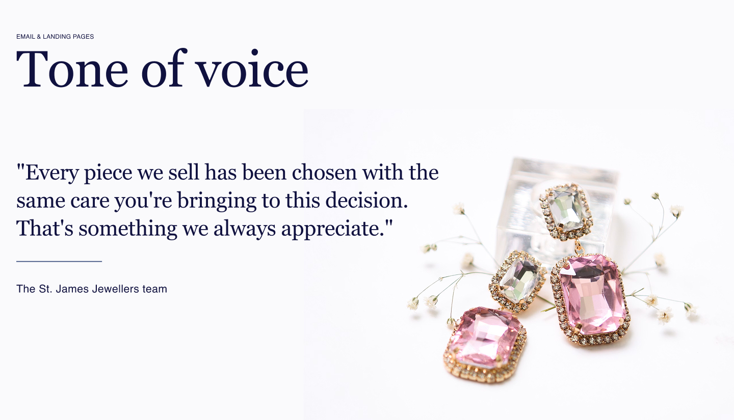
Once the personas were clear, the tone of voice followed naturally: heritage and trusted, considered rather than aggressive, warm authority, and service-led. No "hurry," no "don't miss out," no countdown timers screaming for attention. Instead, take your time; we're here when you're ready. A piece like this is worth taking your time over.
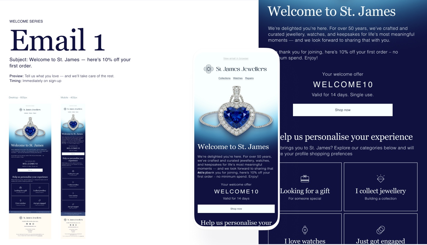
The first flow sets the tone for everything
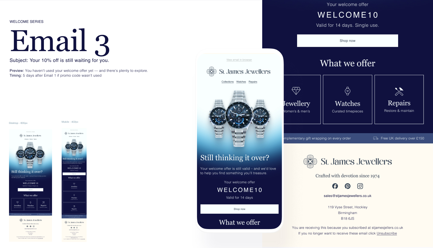
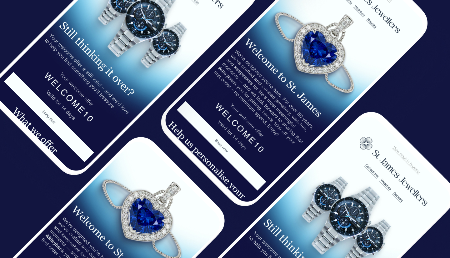
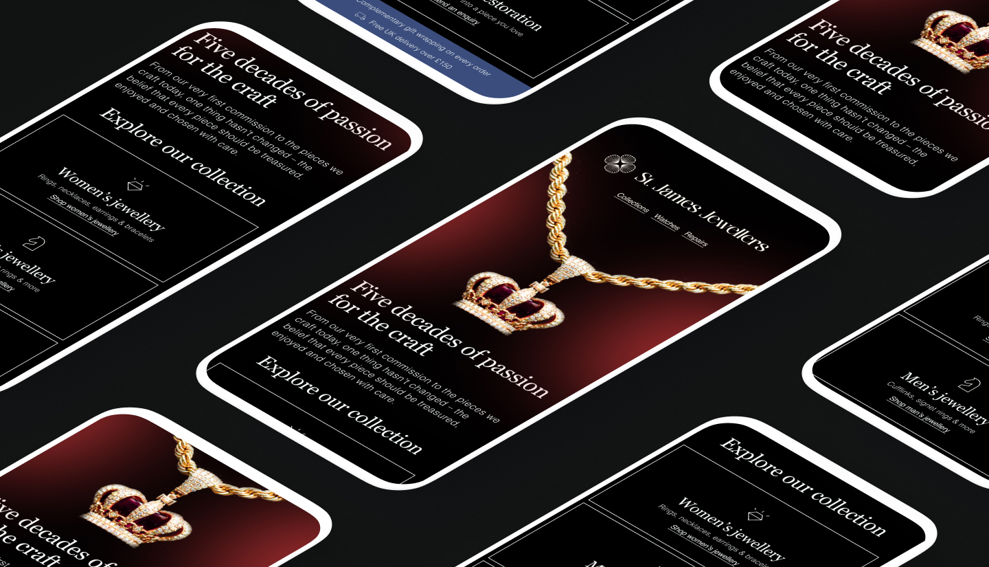
The welcome series [Flow 1] was the first thing I built, and it's doing a lot of quiet work. Email 1 leads with the brand story and a 10% welcome offer — but Emails 2 and 3 deliberately hold back on discounting, focusing instead on heritage ("five decades of passion for the craft") and preference capture, so the system learns whether someone's a gift buyer, a collector, or newly engaged before it ever talks to them again.
That preference data becomes the backbone of everything downstream — which products show up in the newsletter, which gift guide segment someone sees during Valentine's, even which tone a re-engagement email takes.
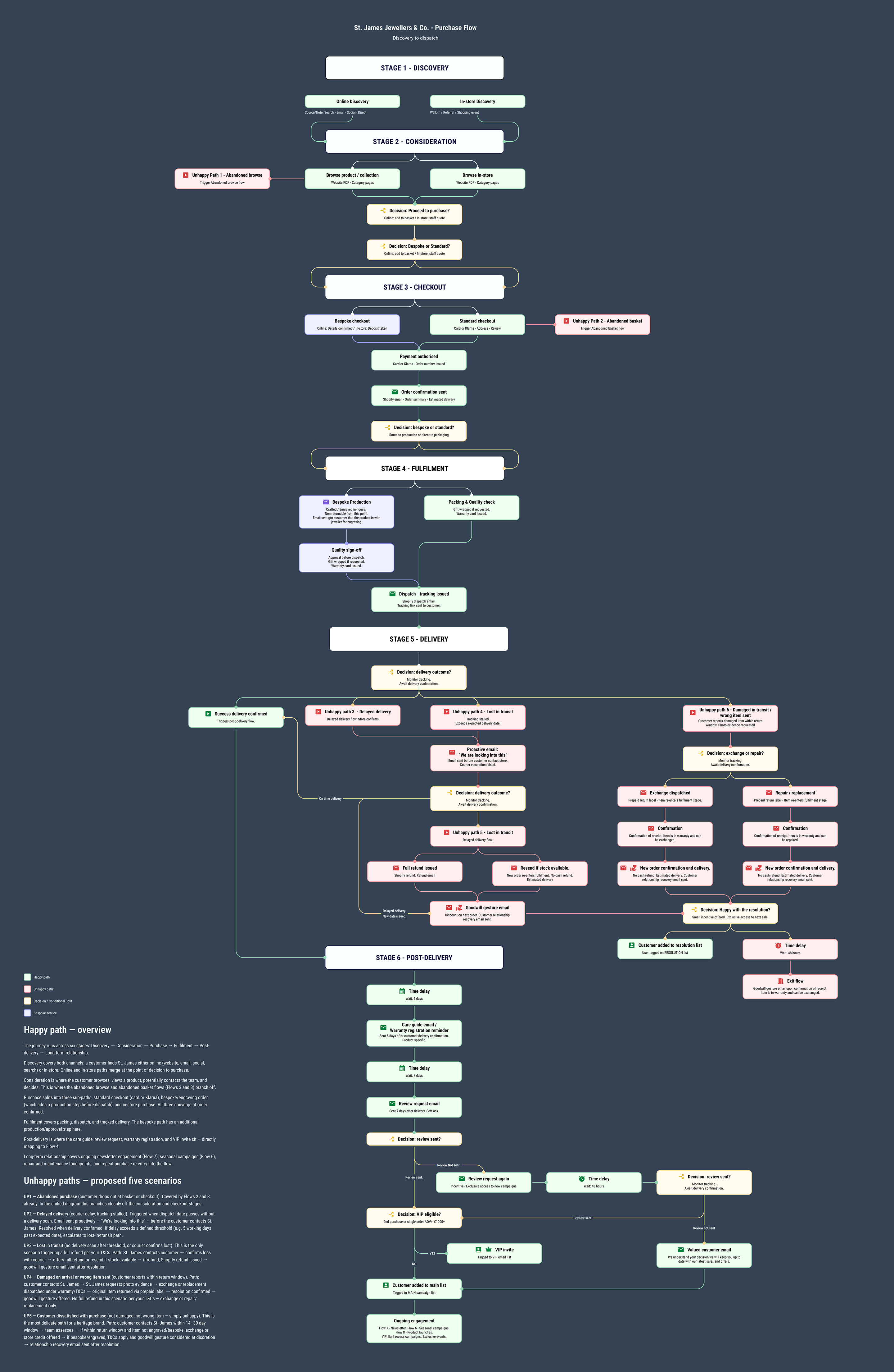
Why no flow uses a discount as its main lever
This is probably the single biggest departure from "standard" ecommerce email thinking, and it's worth calling out directly. Across all eight flows — abandoned browse, abandoned basket, post-purchase, re-engagement, seasonal campaigns, the newsletter, product launches — discounts essentially don't appear as a primary mechanism. [Flow 3, Email 3] is literally titled "A piece like this is worth taking your time over," with the subject line doing double duty as both reassurance and brand positioning.
Instead, the value propositions doing the heavy lifting are complimentary gift wrapping, engraving, warranty, and repair/maintenance service — all genuinely useful and reinforcing the idea that St. James is a long-term relationship, not a transaction.
The takeaway
Building an email strategy for a considered-purchase brand means resisting almost every instinct the ecommerce playbook gives you. No urgency, no constant discounting, no "act now." Instead: persona-led segmentation from day one, a tone that reads as expert and patient rather than salesy, and value propositions built around service rather than price.
In Part 2, we'll get into the eight flows themselves — how they're structured, why ready-made automation makes such a difference for a brand like this, and what "build once, earn forever" actually looks like in Klaviyo.