Built to Last, Part 3:
Why a jewellery brand's emails should look like a lookbook, not a leaflet
Creative, UX, and the design system behind the St. James Jewellers email programme
A quick note before we start: St. James Jewellers & Co. is a fictional brand created purely for illustration — the name, branding, and products are entirely invented, and any resemblance to a real jeweller, living or trading, is coincidental. This series is an educational and illustrative exercise, not financial or business advice. The figures discussed later in the series are directional benchmarks rather than guarantees.
Lead with the piece, not the pitch
This is the part of the project that's most fun to talk about — and also the part where the strategic thinking from Parts 1 and 2 either shows up on screen or it doesn't.
Walk into a good jewellery shop and notice what's not happening: nobody's shouting about percentages off. The pieces are lit well, spaced generously, and given room to be looked at. That's the visual merchandising principle we translated directly into the email templates.
Across all the wireframes — the welcome series, abandoned basket [Abandoned Basket wireframes], post-purchase [Post-Purchase wireframes], and the Valentine's campaign [Flow 6 / Flow 9] — the ratio of image to copy is deliberately skewed toward imagery. A hero product shot, generous whitespace, a short headline, two or three lines of copy, then the piece itself doing the talking. Compare that to a typical fashion-retail email, which is often copy-dense and crammed with multiple competing offers — completely the wrong energy for a £1,200 engagement ring.
Automations (Flows) 02 & 03 – Abandoned browse & Abandoned basket
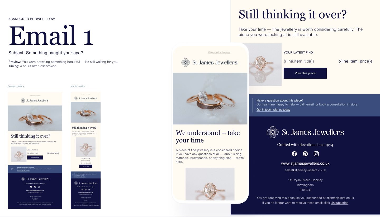
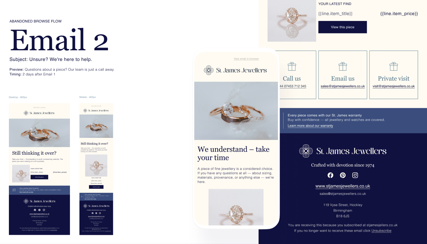
Heatmapping logic, applied before a single email was sent
Even without running live heatmap tests yet, the templates were built as if the heatmap data already existed — because the F-pattern and Z-pattern scanning behaviour for emails is well understood. Eyes land top-left, sweep right, then drop down the left edge looking for the next anchor point.
That's why every template follows the same rhythm: logo and top bar (brand recognition, instant), hero image (the emotional hook), a short headline directly beneath it (the eye has already arrived here), then the CTA. In the Valentine's gift guide [Flow 6, Email 3], this gets more sophisticated — dynamic content blocks shift the first product shown depending on whether the recipient is tagged as newly engaged, a watch enthusiast, or a general gift buyer. The highest-attention real estate in the email changes per segment, automatically.
Automation (Flow) 09 – Valentine's day sales event
Merchandising techniques, translated to a 600px canvas
There's a common worry with automated flows: that they feel robotic, or that personalisation gets sacrificed for scale. The In-store merchandising relies on a handful of repeatable techniques: the "hero piece" placed at eye level, complementary pieces grouped nearby, and a clear path from "browsing" to "considering" to "ready to buy." The email templates mirror all three:
- Hero treatment — one piece gets the largest image and the most editorial framing (see the "Editor's Pick" treatment in Flow 6, Email 4).
- Grouped exploration — three-across product grids let someone browse without feeling pushed, used consistently in the newsletter [Flow 7] and product launch [Flow 8] templates.
- The considered path — abandoned basket emails [Abandoned Basket wireframes] don't open with "complete your order" — they open with reassurance ("your selection is still in your basket — ready when you are"), gradually introducing gifting services before the final, gentlest nudge.
Automations (Flows) 08 & 09 – Newsletter & Product launch
One template, many flows — and why that's the point
Look across the wireframes for Flow 1 (Welcome), Flow 3 (Abandoned Basket), and Flow 5 (Re-engagement) and you'll notice the same bones every time: header with logo and navigation, hero image block, headline, short body copy, product card(s), a single clear CTA, a trust strip (gift wrapping/warranty/delivery), and the footer with social links and the "Crafted with devotion since 1974" signature.
What changes is tone and content, not structure. The welcome series uses a richer, branded navy treatment [Welcome Series wireframes]. Abandonment flows use a lighter cream palette with the same components rearranged. The re-engagement "should we stay in touch?" email [Re-engagement wireframes] strips everything back to two simple subscription-choice cards — recognisable as the same brand, but visually quieter, matching the more delicate tone of that message.
This is, in effect, a component library — built before the term "design system" was ever mentioned to the client.
Automatios (Flow) 05 – Re-engament
The design system: why this is the highest-leverage investment in the whole project
Here's the thing about design systems that's easy to undersell: the first email using a new component is expensive. The fiftieth is nearly free.
The St. James design system [see design system reference sheet] defines the essentials — Georgia for headings, Helvetica for body copy, a nine-colour palette built around deep navy (#10113F) with warm accent tones, an 600px desktop / 402px mobile grid, and a logo lockup with the compass/star mark. Every wireframe across all eight flows draws on the same toolkit.
The payoff shows up the moment a new flow needs building. Need a new seasonal campaign? The hero block, product cards, trust strip, and footer already exist — only the imagery, headline, and offer change. Need a new VIP-tier email? The St. James Circle invite [Flow 4, Email 4a] reuses the same card components as the newsletter's VIP block [Flow 7].
For a brand this size, that's the difference between every new campaign requiring a small design project and every new campaign being an afternoon's work — assembling existing pieces rather than designing from scratch. Scale without proportional cost increase is, frankly, the entire economic case for a design system, and it compounds every time the brand runs a new campaign.
VIP emails
The takeaway
Good email design for a considered-purchase brand isn't about more — more copy, more offers, more urgency. It's about restraint, rhythm, and repetition: the same visual language appearing consistently enough that customers recognise St. James before they've even read a word, paired with enough imagery that the product does most of the persuading.
And the design system underneath it all means that consistency doesn't cost more over time — it costs less, the more it's used.
In Part 4 — the practical one — we'll talk numbers: what a brand like St. James might realistically budget for this kind of programme, what it costs to bring in a freelancer who can design and build the Klaviyo side, and what kind of return that investment could generate.
Tags: email design system, ecommerce UX design, email UI design, Klaviyo email templates, visual merchandising email, email heatmap optimisation, jewellery brand design, responsive email design, brand consistency email marketing, design system scalability
A note on this series: St. James Jewellers & Co. is a fictional brand, created purely for illustration — the name, branding, products, and customer base are entirely invented. The figures referenced throughout (budgets, rates, and projected returns) are based on publicly available industry benchmarks and current freelance market data; these third-party sources have not been independently verified, and their accuracy cannot be guaranteed.
This content is provided for educational and illustrative purposes only and does not constitute financial, business, or investment advice. No representation is made that any business will achieve similar results, and there is no "typical" outcome to compare against — actual performance depends on the size of the business, its existing audience, budget, and a wide range of factors that can shift over the course of a financial year. Anyone considering a similar project should seek independent advice and conduct their own due diligence before making decisions based on this content.
All flows and templates were built in a Klaviyo sandbox environment as a theoretical exercise. Anything shown here should be A/B tested before being used in a live account, and the approach can be adapted to other platforms — Mailchimp, HubSpot, and others — with the same underlying principles. This series focuses solely on the email channel; it doesn't account for social media, on-site forms, paid acquisition, or other channels that typically work alongside it as part of a broader marketing strategy. Images are free for use and are sourced from unsplash.com and pixabay.com.