From Brief to Brand:
Designing a Checkout Experience People Actually Want to Use
Case study no. 02 — the second in an ongoing series where I take a fictional brief and build it like it's real.
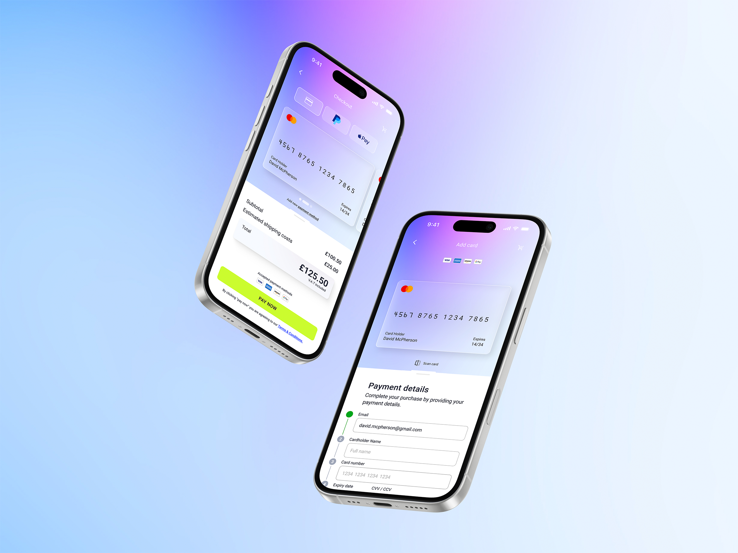
Nobody opens an e-commerce app hoping the checkout will be memorable. They just want it to work — fast, clearly, without friction. So when DailyUI dropped prompt 002 (design a credit card checkout), I didn't treat it as a UI exercise. I treated it as a trust problem.
Because that's what payment design really is. You're asking someone to hand over their card details. Every decision you make — the colour of a button, the placement of a field, the moment a green tick appears — either builds that trust or erodes it.
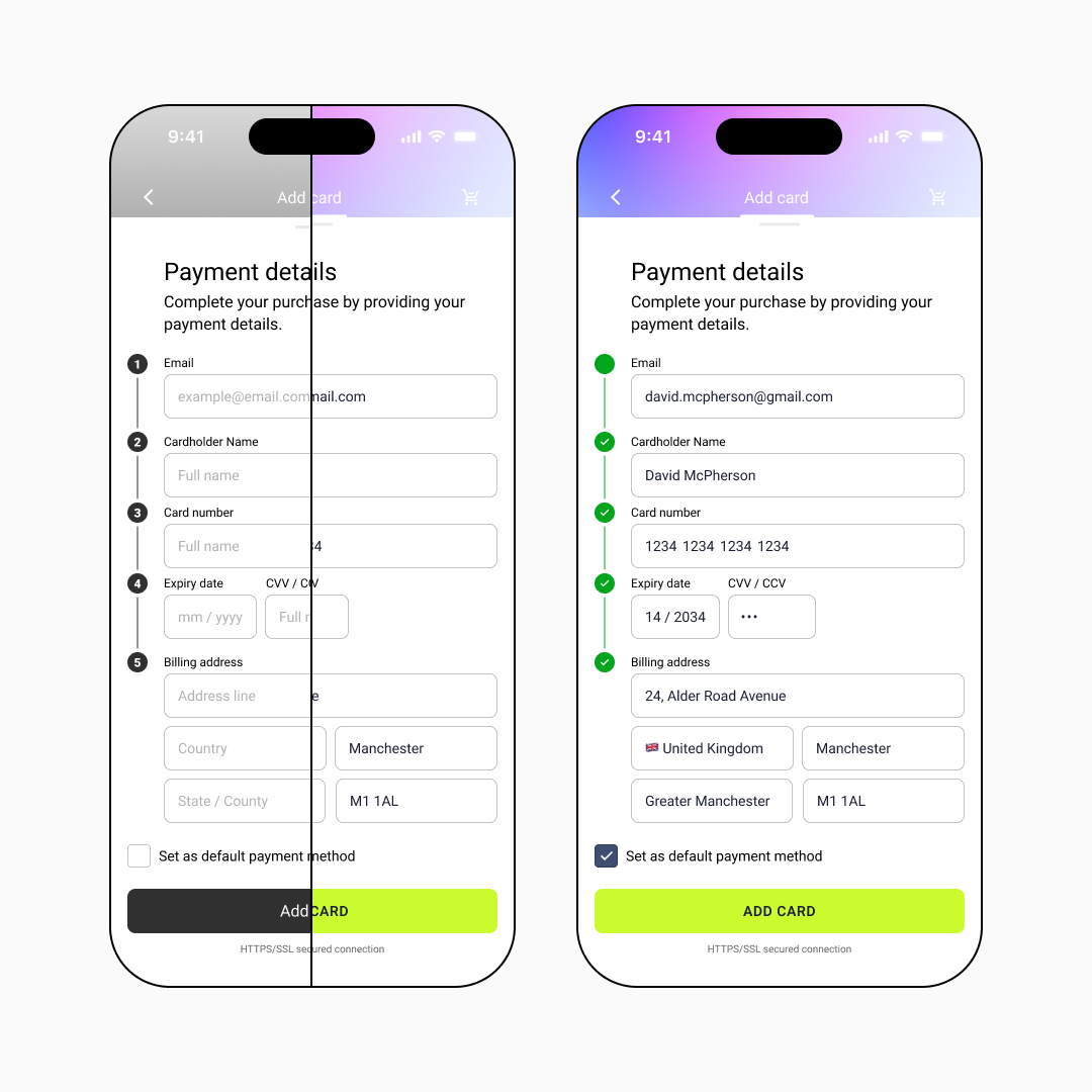
Where it started: the wireframe
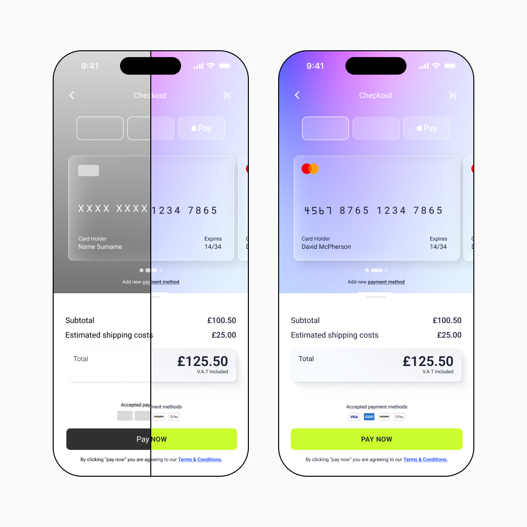
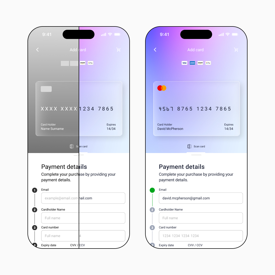
Before a single colour was chosen for the project, I started thinking about the wireframes. Structure first.
Testing it on a real device
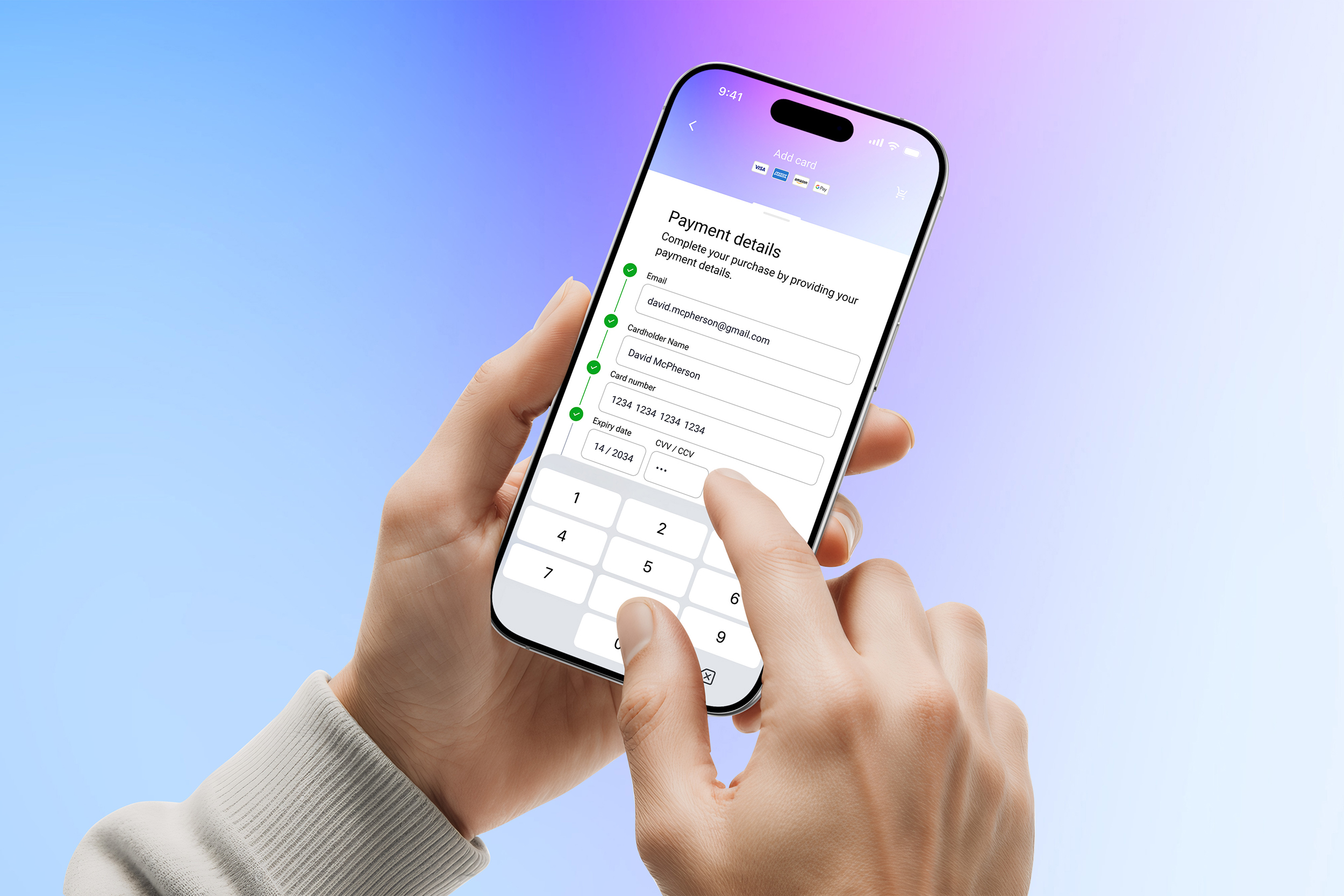
Here's where a lot of designers skip a step: they design for a screen, not in a hand.
Before I polished a single frame, I loaded the prototype onto my phone and used it. Properly used it — one thumb, real keyboard, real scroll behaviour. And that's where the UX principles moved from theory into practice.
A few things surfaced immediately:
- Touch target sizing.
Form fields and CTAs need to be large enough to tap accurately under pressure, not just look proportionate on a design canvas. - Keyboard behaviour.
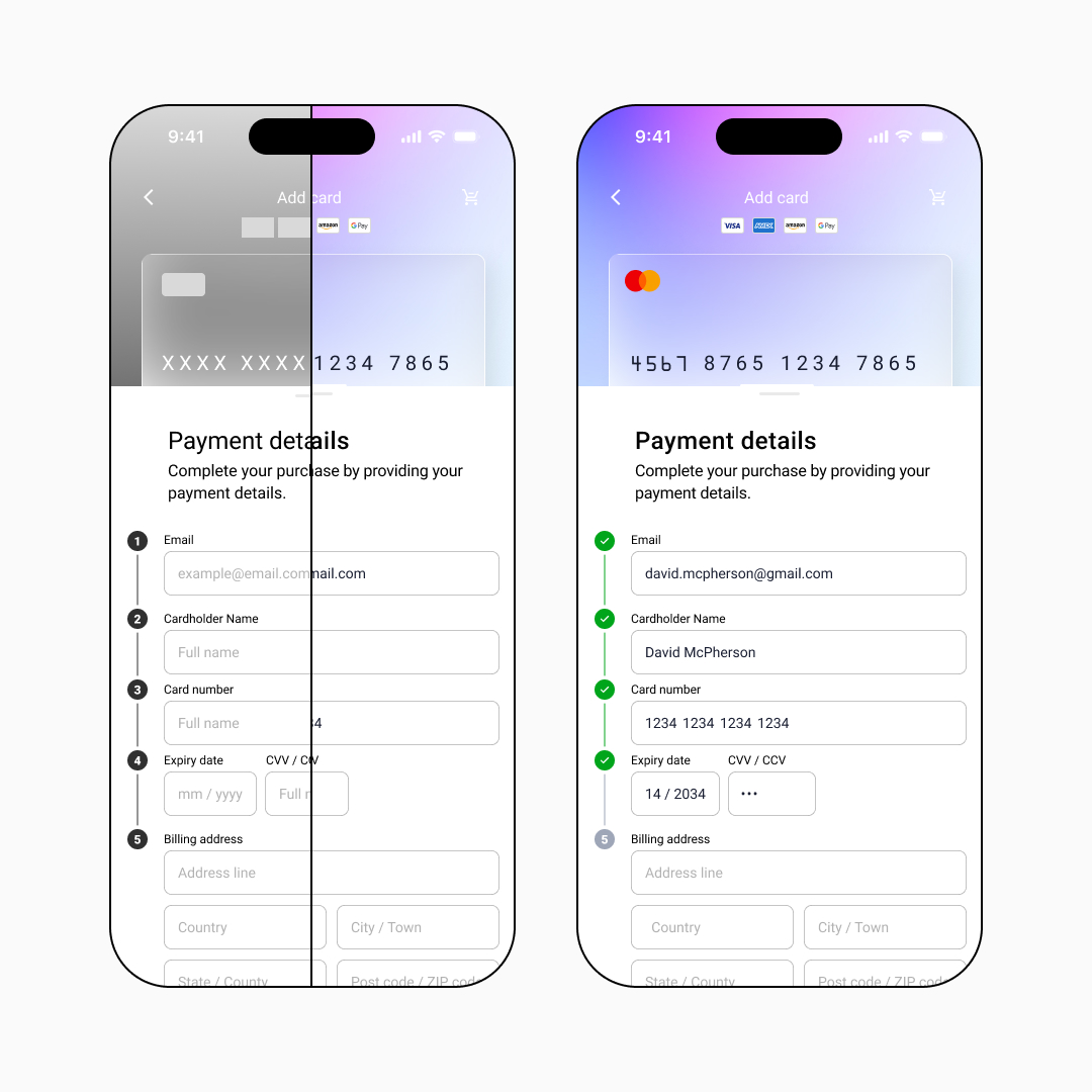
When the numeric keypad triggers for the card number and CVV fields, does the layout still hold? Does the user lose context of where they are in the form? - Progress feedback.
The numbered step indicators with their green validation ticks aren't decorative. They're functional reassurance — they tell the user they're moving forward, one field at a time.
The design decisions worth talking about
The card visualiser. The credit card component at the top of the screen isn't just a nice touch — it's a UX anchor. As the user fills in their details, the card populates in real time. It converts abstract number strings into something recognisable and familiar.
What this project reinforced
Checkout UI sits at the intersection of visual design, UX psychology, and conversion optimisation. It's one of the most scrutinised screens in any digital product — and one of the most commonly under-designed.
The principles that kept this project tight:
- Wireframe first.
- Test on a real device before you call anything finished.
- Every visual decision should have a functional reason.
- Trust is earned in small, quiet moments — a tick, a label, a line of security text.
Tags: checkout UI design, mobile UX design, payment form design, e-commerce UX, DailyUI challenge, wireframing, mobile-first design, conversion optimisation