
From Brief to Brand:
What a DailyUI Challenge Taught Me About Real-World Design
Case study no. 01 — the first in an ongoing series where I take a fictional brief and build it like it's real.
I decided to dive into the DailyUI challenge, and honestly, it’s a fantastic way to flex your creative muscles. It gives you the mental space to experiment and create without stressing over the outcome. Usually, a prompt arrives in your inbox, you spend a day designing something, and then most people move on. I wondered what might happen if you didn't let go and instead treated the brief as a real-world project.
So, the big question became: what if you approached a fictional brief with the same care, strategic thought, and craftsmanship you'd give to a paying client?
Upparel is the answer to that question.
The brief
A fictional clothing retailer. A newsletter sign-up flow. The creative hook: sign up to dress up.
From that single line, I built a full campaign — not just a screen.

What I built
Five touchpoints: a mobile sign-up screen, a desktop landing page, a welcome email complete with a promo code, a TikTok profile view, and a real-world phone mockup. Each one consistent, each one considered, each one designed as if a marketing director was waiting on the other side.
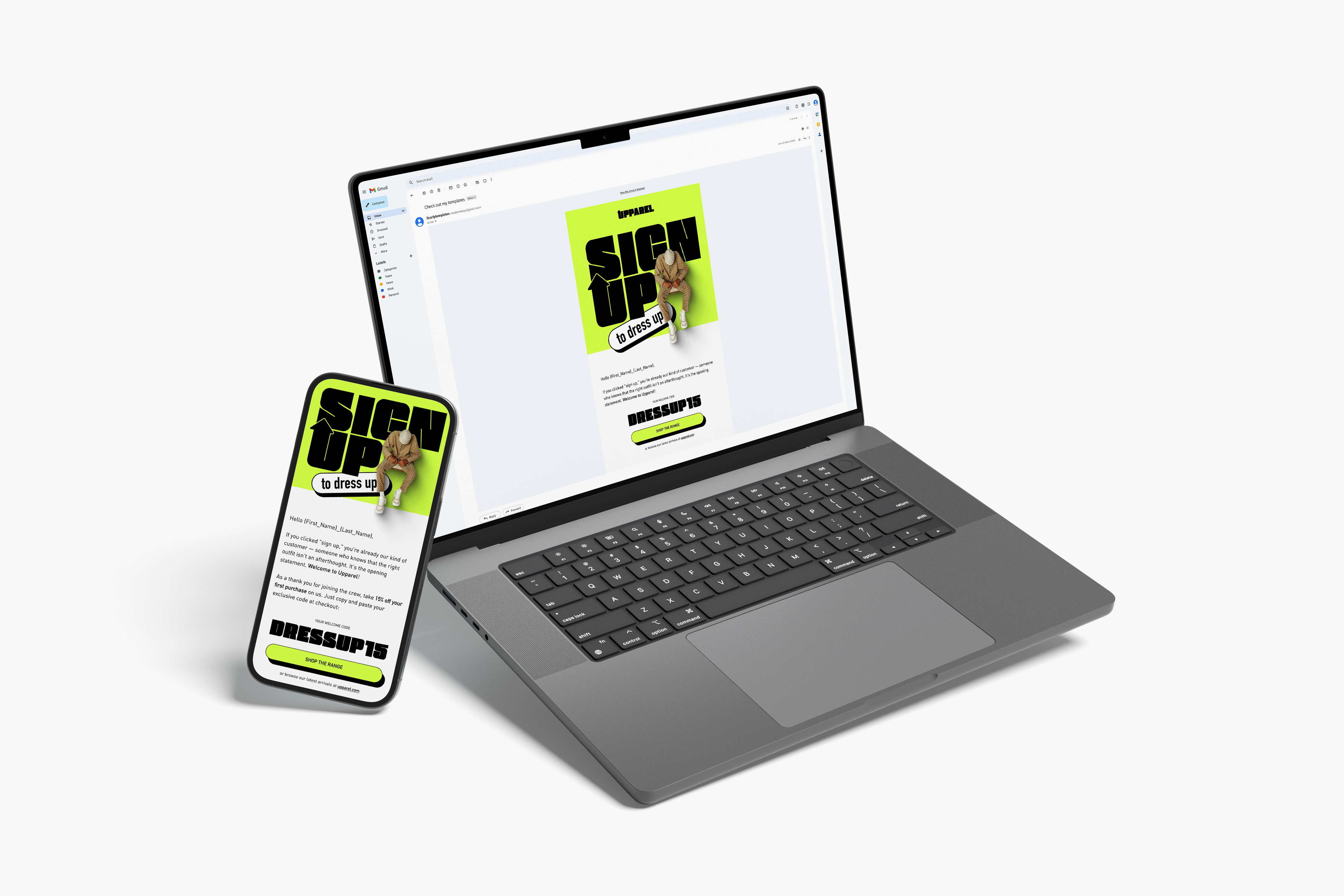
The welcome email was a particular favourite. The promo code — DRESSUP15 — is styled like a headline rather than a footnote. Because if you're giving someone 15% off, it should feel like a gift, not a terms-and-conditions line.
Why this approach matters
Treating a fictional brief as if it were real compels us to consider three vital aspects often overlooked in UI challenges:
- Strategic thinking.
What is this brand truly trying to communicate? Who is its target audience? - Cross-channel consistency.
A compelling single-screen design is not a campaign. Does it remain effective across all touchpoints? - Discipline under no pressure.
Without client constraints or deadlines, the work can be at its purest and finest.
The welcome email was a particular favourite. The promo code — DRESSUP15 — is styled like a headline rather than a footnote. Because if you're giving someone 15% off, it should feel like a gift, not a terms-and-conditions line.
The outcome is a portfolio piece that appears authentic — because, in every meaningful way, it was approached as real.

What's next
This is the first post in From Brief to Brand — a series in which I take fictional prompts and turn them into work that could go live tomorrow. If you're curious about the process, stick around.
Tags: DailyUI, email design, brand identity, UI/UX, portfolio, e-commerce, creative process