NeoNexum
UX/UI Design
Mobile App
Intelectual entertainment
History never repeats itself.
...but it always leaves a paper trail.
[ History is vast. Finding your place in it shouldn't be. ]
Millions of readers are deeply curious about history — but the tools that exist either overwhelm them with noise or lock knowledge behind institutional walls. NeoNexum set out to bridge that gap: making the attic of human events feel navigable, social, and alive.
73%
Readers can't find peers who share their specific interests
2.4B
Books indexed online with no meaningful social layer
60%
Institutional collections underexposed to new audiences
User quote:
"I find something fascinating and then… nothing. No one to discuss it with."
"I find something fascinating and then… nothing. No one to discuss it with."
[ ROLE ]
UX/UI Designer
[ TIMELINE ]
35 WEEKS
[ PLATFORM ]
APPLE OX, ANDROID
[ DESIGN ]
FIGMA
[ PROTOTYPE ]
FIGMA MAKE
[ CODE ]
FLUTTERFLOW
[ Every great discovery starts with the right person ]
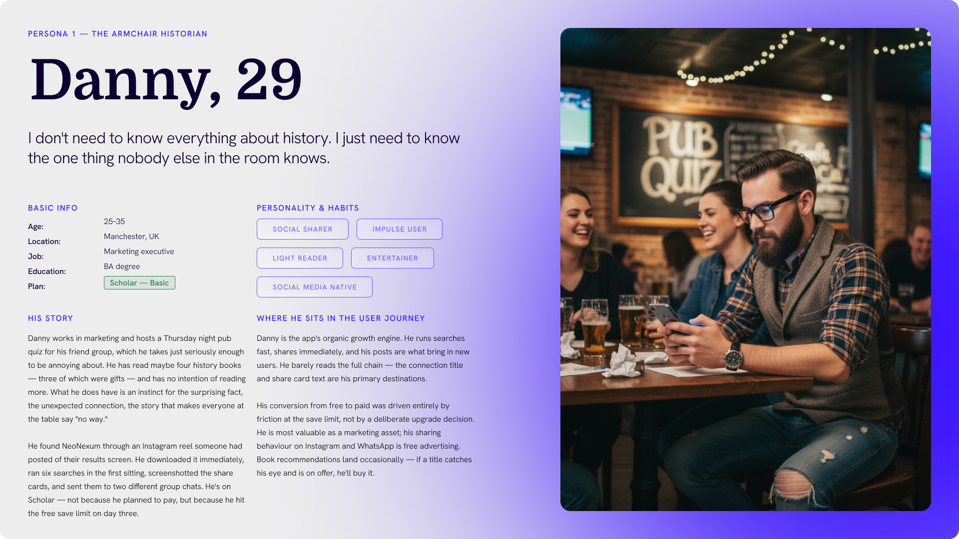
Two archetypes sat at the heart of every design decision — the intellectually restless reader who wants depth without algorithms, and the institutional guardian who has extraordinary collections and almost no way to share them. Their needs are not in conflict; they're complementary.

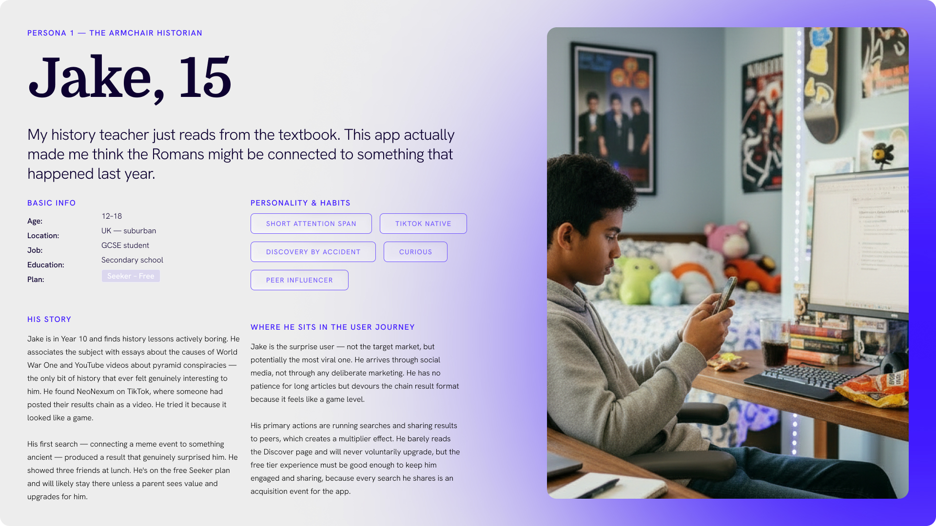
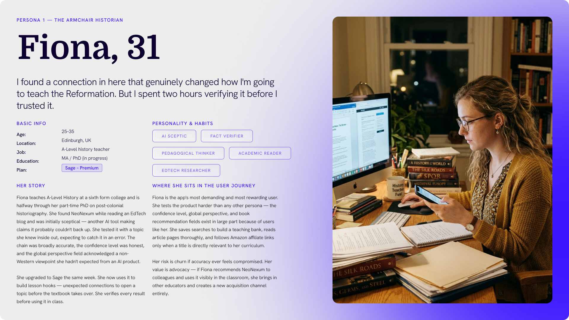
[ Connect people to ideas. Connect ideas to history. ]
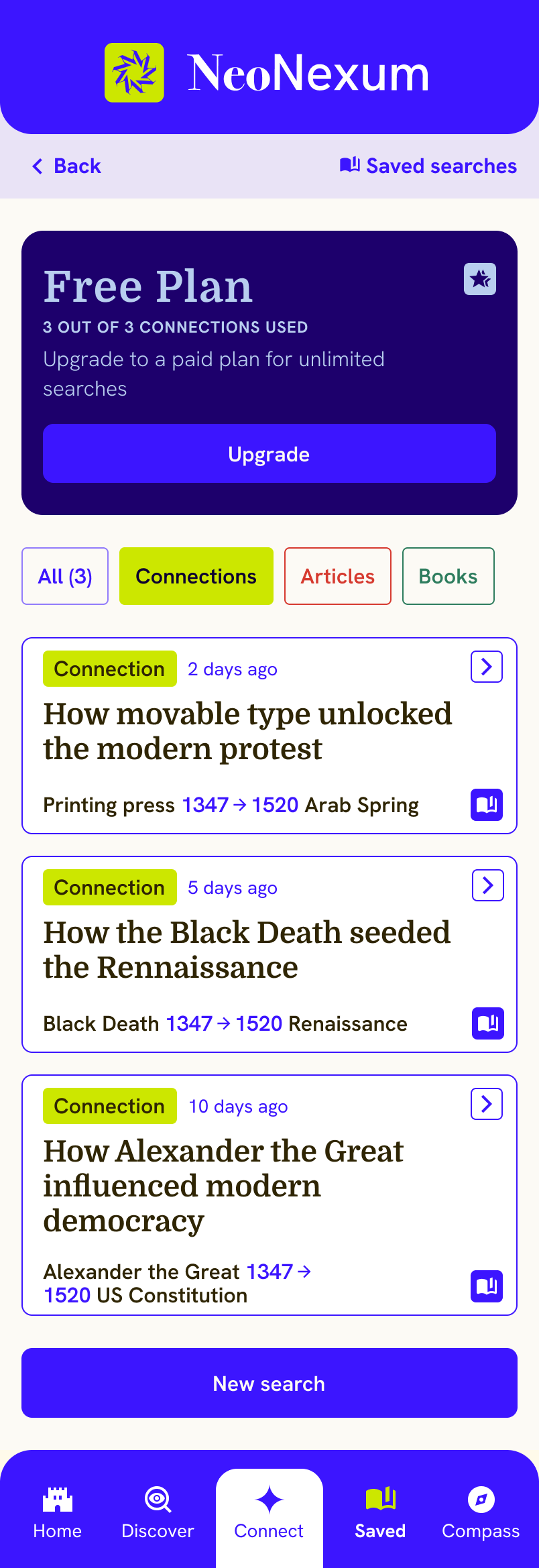
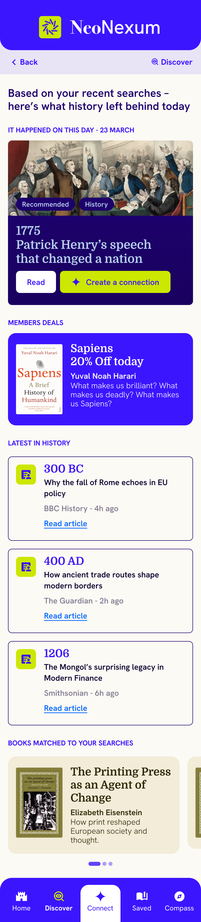
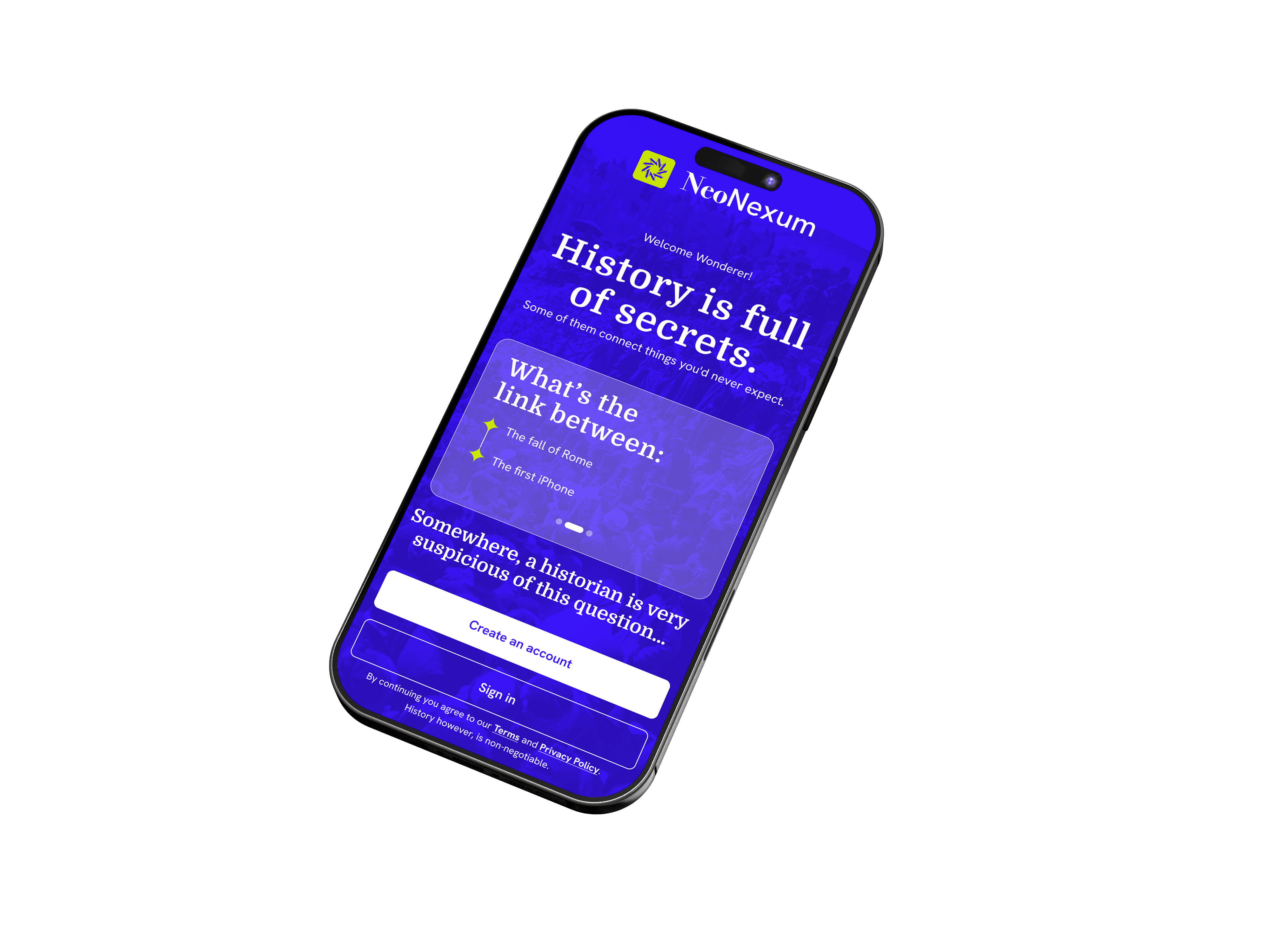
NeoNexum is a discovery platform that surfaces rare books and institutional collections alongside the people who find them fascinating. Enter a modern event and trace the thread back. Find a reader whose obsessions overlap with yours. Build something real from a shared intellectual starting point.
Connect
Find readers who share your specific intellectual obsessions
Discover
Surface rare books and institutional archives you didn't know to search for
Belong
Join communities gathered around eras, ideas, and events that still matter
[ We went rummaging. Here's what we found. ]
Research began where NeoNexum itself does — in the archives. Eight user interviews, a competitor audit, and a deep dive into the institutions already doing this work quietly and brilliantly. The findings confirmed the gap and shaped every design choice that followed.

Desk research & audit

User interviews (8)

Competitor analysis

Affinity mapping

Insight synthesis
[ Four directions explored. One worth building. ]
Ideation followed the findings — not a blank whiteboard, but a structured set of How Might We questions drawn directly from what users told us. Four concept directions were sketched and pressure-tested. Two were discarded. One became NeoNexum as it exists today.
[ HMW ]
Surface rare collections to casual readers?
[ HMW ]
Help people find intellectual peers?
[ HMW ]
Make history feel alive and relevant?
[ HMW ]
Reward deep engagement over scrolling?

[ A ]
Curated reading trails
[ B ]
Social annotation feed
[ C ]
Connection search + rec engine
[ D ]
Gamified reading challenges
[ Two journeys that carry the whole product ]
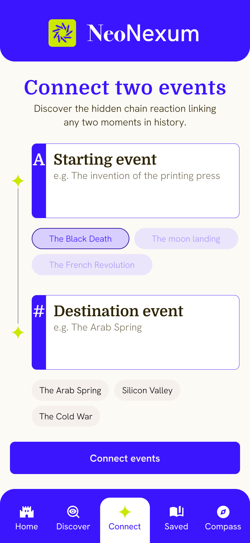
Registration needed to feel like an invitation, not a form. Search needed to feel like serendipity, not a database query. These two flows were the proving ground for both — simplified here to show logic and branching, not final UI.

[ USER REGISTRATION FLOW ]

[ CONNECTION SEARCH & BOOK RECOMMENDATIONS ]
[ Ink, parchment, and a jolt of something modern ]
The visual identity draws on the materiality of archives — deep ink tones, warm parchment backgrounds, and the quiet authority of institutions that have been keeping records for centuries. Then it breaks from it: a sage green primary action colour that feels alive and forward-looking, not dusty.
[ Structure before surface. Logic before colour. ]
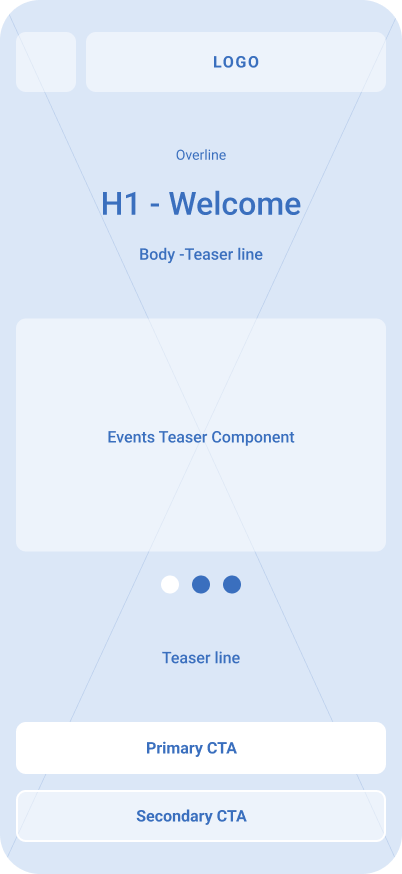
The wireframes emphasise hierarchy, information density, and the placement of trust signals. Each screen was thoughtfully designed with a clear UX rationale, incorporating accessibility guidelines and best UX practices throughout.


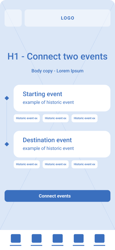
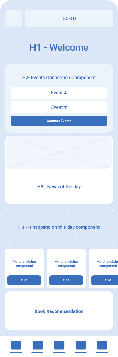
[ One library.
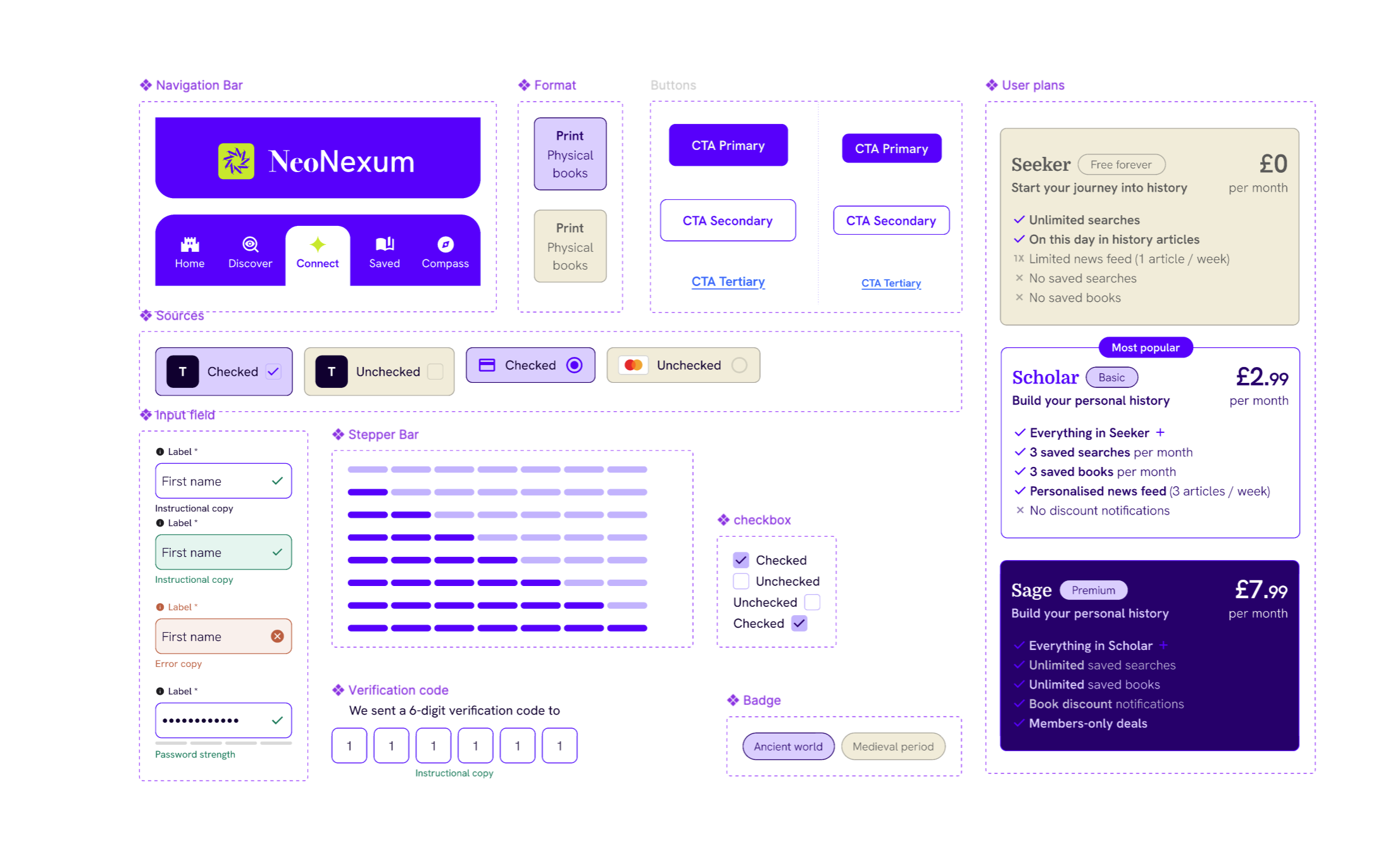
Every screen consistent with the last. ]
A shared component library keeps NeoNexum coherent as it grows — from its first three screens to its fiftieth. Tokens, not hardcoded values. Components built to flex, not to break. A system any developer can pick up on day one.
[ The product as EXPERIENCED ]
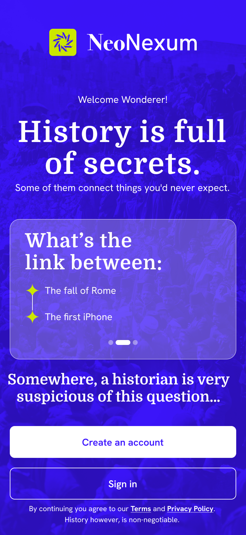
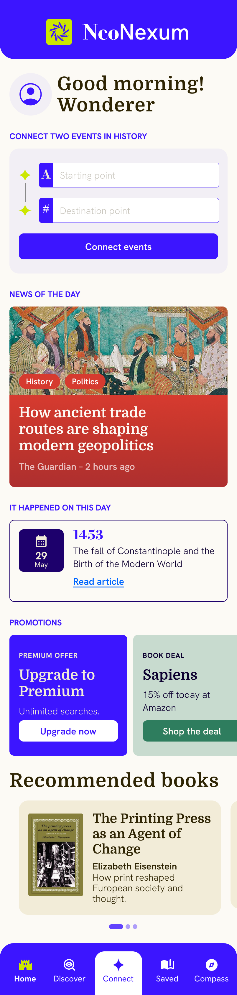
Final screen designs in context — the point at which structure, brand, and UX decisions converge into something a real person would actually want to use.